Talk:ProgClub logo
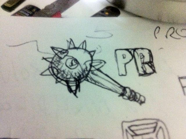
Actually, there are two pics of a club there - one full-size and one close-up of the tip.
Thus, at first glance, it looks more like a morningstar than a club.
...figured you might wanna know... :-)
(congrats on the awesome mediawiki theme by the way!)
The current logo is just a stand-in while ProgClub's graphic artist comes up with the real logo. The real logo is a single image of a club. Below is the first sketch.
(Thanks!)
John 16:34, 5 August 2011 (UTC)
> John 16:34
Really !?! http://www.biblegateway.com/passage/?search=John+6%3A16-34&version=ESV
(just kidding; your timing was accidentally proverbial)
Yeah.
John 11:48, 6 August 2011 (UTC)
http://www.biblegateway.com/passage/?search=John+11:48
The logo has been changed to the glider, as detailed on the ProgClub logo page.
John 05:45, 14 August 2011 (UTC)
